With the emergence of mobile devices as a significant source of online traffic, responsive design is rising as an important tool in a developer’s set of skills.
Why Responsive Design?
According to the tenets of responsive design, websites should adapt to different resolutions, supporting devices ranging from smartphones to desktops with full-sized monitors. Not only do websites have to look great, but they also have to perform well across the scope of connectivity options that mobile devices have introduced. Fortunately, Chrome has made it easier to test responsive design through Developer Tools by integrating a powerful emulation feature: device mode.
Device mode can emulate a mobile environment to test a website’s responsiveness in different devices. This mode can change the resolution of your page to reflect the size of screens from devices like the Samsung Galaxy S4 and the Apple iPad. You can also test your site with different throttling options.
.
Prerequisites
– Any modern version of Chrome. If you want a more developer-centric tool, try Chrome Canary.
Toggle Device Mode in Chrome
If you’ve never been inside Developer Tools before, click F12 or open Chrome’s menu > More Tools > Developer Tools.
To activate device mode, simply click the device icon in the top left corner of the Developer Tools window.
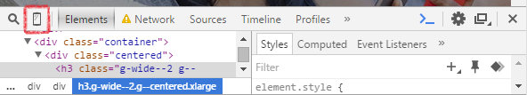
Click to the icon to toggle device mode.
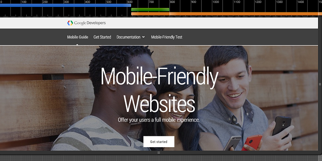
A toolbar will appear at the top of the page where Chrome will emulate different devices with viewport sizes, throttling options, and other features.
Navigating the device mode toolbar.
.
Select Device
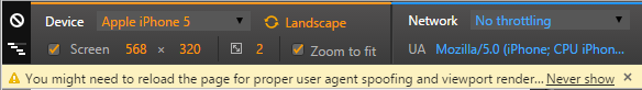
To emulate a device, select it from one of the preset devices in the drop-down menu. Depending on the device, users may be given the option to choose Landscape and Portrait orientations. You also have the option to enter your own pixel dimensions if you prefer. Refresh the page so that the right viewport size and user agent string is set.
.
What just happened?
When you refresh the page, the viewport size immediately changes to reflect the selected device’s height and width. The console also activates touch events so that developers can test events like dragging and multi-touch. Note that this change deactivates certain CSS styling rules for mouse-based events. The browser’s user agent string updates as well under the UA section to the right. Now you can almost perfectly replicate how your page would look and function on a specific device.
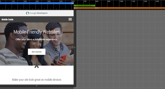
Let’s see what happens when we select the Apple iPhone 6 from the device list and refresh.
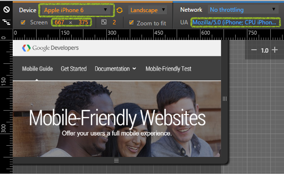
Apple iPhone 6 emulation
As we can see from above, the resolution changes to 667 x 375 (if your orientation is set to “Portrait”, the resolution will be 375 x 375), and the UA updates to match the default iPhone user agent string.
.
CSS Media Queries
Now that we have changed the viewport, let’s take it one step further and learn how to inspect media queries. Media queries apply CSS styling to defined widths, heights, aspect ratios, orientations, and other properties. Through media queries, developers can add specific styling rules, or even assign different style sheets, to varying heights and widths to make sure the design looks great across all devices.
To view media queries in device mode, click the following icon:
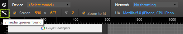
Hovering over the icon will show the media queries detected.
For each media query, a clickable bar will appear below the icon.

Try clicking the bars or dragging the edges of the viewport to adjust the size.
In the case of this particular web page, clicking each bar will expand the viewport within the ranges of the max-width or min-width specified in the media queries.
Media query with max-width set to 619px.
Media query of min-with set to 800px.
In the two examples above, you can see how different style rules are applied according to media features.
From there, you may right click the media query bar and select Reveal in Source Code. This option pulls up the style sheet associated with the media query in the Source panel. You can fiddle with the CSS to test out different styling options for the media query, making this a powerful resource for frontend development.
.
Network Throttling
Now that we know how to test CSS against different devices, let’s investigate how the site performs at different speeds. Before device mode, Developer Tools already had a method for testing network performance in the Network panel. But with device mode, developers can select a device and choose from a variety of connectivity speeds to test with, such as 3G or 4G. Even offline connectivity is an option here.
With the Network panel open, select the desired speed from the drop-down and refresh the page. Each asset that is loading appears in the waterfall view in the Network panel. When the page completes loading, you can compare the loaded assets between different device speeds to ensure that your website is optimized.
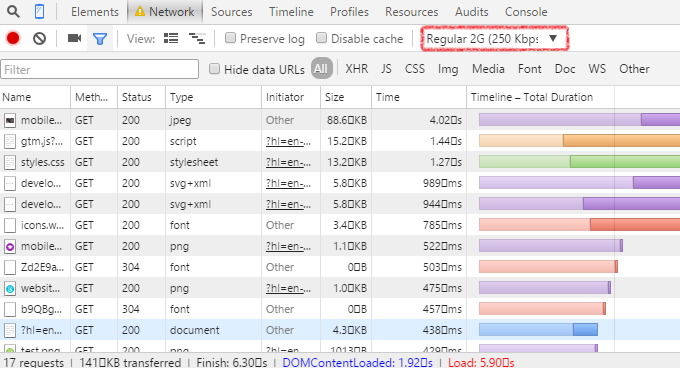
Network Throttling at 2G connectivity
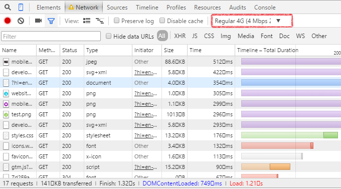
Network Throttling at 4G connectivity
In the screenshots above, you can see the difference between loading times for assets from the 2G connection vs. the 4G connection. Analyzing the size and loading time of each asset from the Network panel waterfall is a very useful method for identifying areas where you can improve or optimize the performance of your site.
.
Conclusion
With powerful features like viewport sizing, media queries, and network throttling, device mode makes testing across devices easier than ever. Taking time to familiarize yourself with the Developer Tools device mode has the potential to save you hours of work and help you to make your site friendly to the increasing variety of devices people use to access the Internet. Try this article using your reliable HIPAA-compliant WordPress hosting solution from Atlantic.Net.
* This post is for informational purposes only and does not constitute professional, legal, financial, or technical advice. Each situation is unique and may require guidance from a qualified professional.
Readers should conduct their own due diligence before making any decisions.